3 Pop-Up Strategies that Won't Hurt Your Website
Google has announced that they’re penalizing sites that use an interruptive pop-up, especially those that cover a significant amount of content.
Can I get a Yay? Yay!
Known in the web marketing and SEO worlds as interstitials – collectors of email addresses and more – pop-up messages are often frowned upon by visitors, creating a barrier to content as people enter a website.
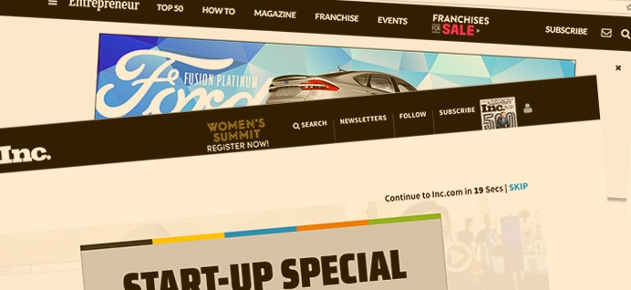
Given Google’s warning, big publishers like Inc. and Entrepreneur just might find themselves in a bit of a pickle, because they currently serve ads in their pop-ups, requiring either a click-through or a time delay in order to view the content.

Many well-known marketers swear by them, claiming (and demonstrating) their success in building subscriber lists – accepting the glares of annoyed visitors – and viewing the tool as the price of entry.
Sure, there are ways webmasters and marketers can reduce the amount of interruption these cause, with time delays, page scroll delays, welcome bars that sit at the top, and more, but what about simply using them in a more respectful and helpful manner?
For example, I believe it’s possible to deploy pop-ups in a number of ways that are welcomed by site visitors, such as:
1. Exit Intent Alert to Offer Assistance
I’m not 100% certain, but I believe the tools watch for a quick mouse movement towards the top left after a period of activity within the site. Presumably, as the visitor is about to leave and begin a new search. Let’s assume the person didn’t find what they were looking for. Why not offer to assist? Can’t hurt.
2. Create a Feedback Mechanism
Instead of asking a website visitor if they’d like to participate in a survey ‘after’ they visit, (which many sites do) people are forced to answer a yes/no question in order to click them away slightly peeved about the interruption, to simply pop up just before they leave the site. Only one instance of the pop-up that way, and after they’ve had an opportunity to view the content.

3. Lasso them with a Surprise Super Secret Offer
This variation of the exit intent pop-up is essentially the last chance to engage and convert, where you offer a special download, discount, or another high-value goody. Run it as part of a campaign, don’t run it all the time, and mix them up a bit so regular visitors don’t get bored with them.
Before closing, I’d like to talk a bit more about those big publishers. Will they accept a possible algorithmic rankings reduction considering they are so highly rated, the reduction would need to be absolutely massive to have any real effect? Or will they sue for damages? Those ads must be making them money. Just what’s it worth to keep them?
In a recent web discussion between John Meilleur of Google and several well-respected SEOs about the coming penalty, there appeared to be some degree of foggery around how and where the penalty would be applied (not a big surprise – Google is often vague about these things so that black hatters have a tougher time circumventing the algo), many assuming it would be done algorithmically vs by manual action.

One SEO asked if the ranking penalty might be applied to the interstitial itself, rather than the page it covered. Now there’s an idea… the pop-up, being the point of entry to a site, if viewed as the content, would presumably rank very low for lack of inbound links, low word count, and poor visitor experience; essentially killing any juice the page would have. Now, that’s motivation to reconsider the application of a pop-up.
In any case, fewer interruptive pop-ups can’t mean anything but better practices around the application of pop-ups as helpful attention-getters vs annoying ones. And that’s got to be good news for visitors and marketers alike.
At Kayak, we’re all about delighting our website visitors. If you’d like to learn how to grow your new business opportunities (without annoying people in the process), we’d like to connect with you.


